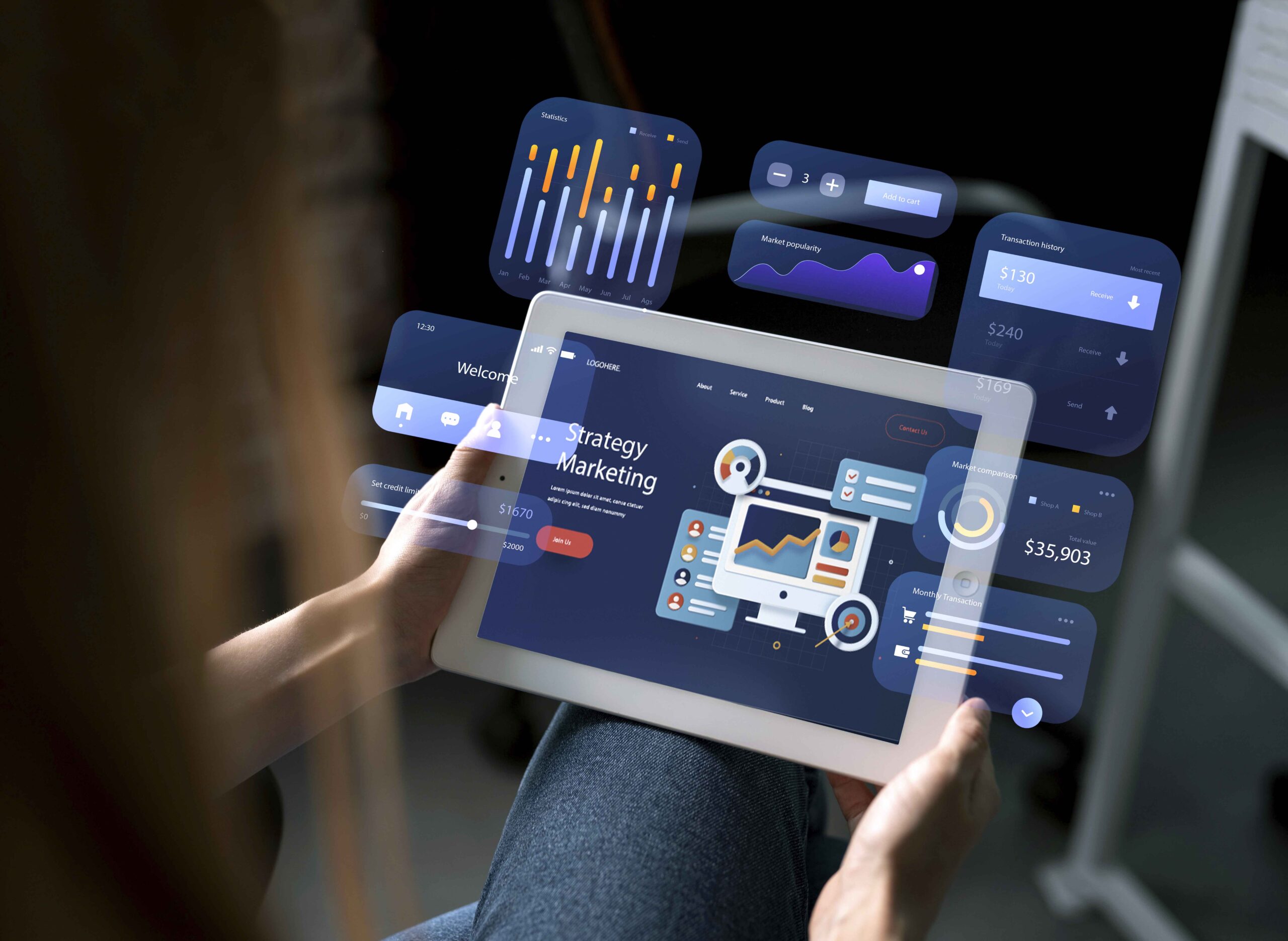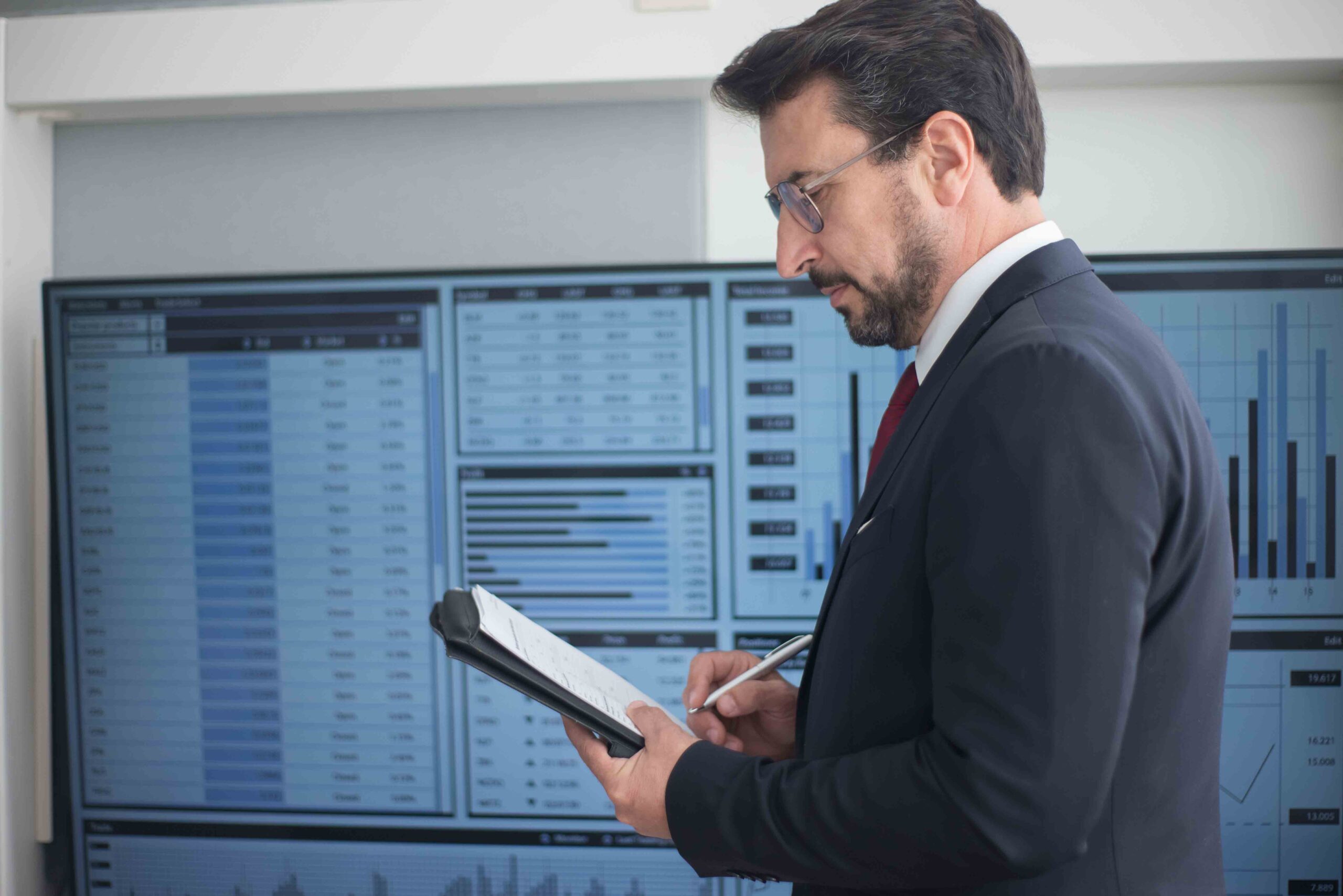

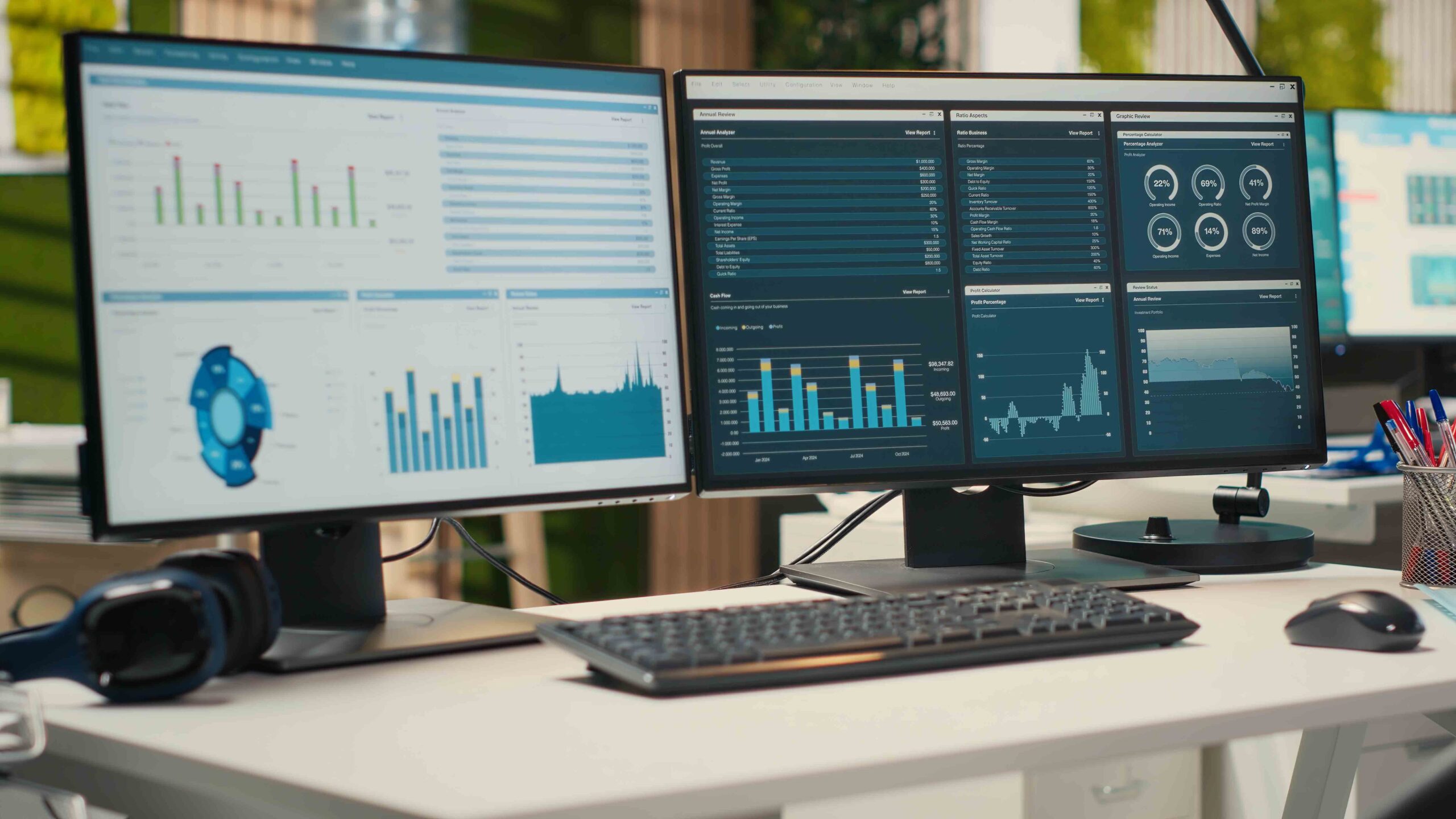
Plenty of ERP systems ship with a dashboard. Far fewer businesses actually make decisions from it day to day. The gap between the two isn’t the dashboard’s design, it’s usually that the numbers on it arrived too late, don’t quite agree with what finance already believes, or sit in a screen nobody remembers to open until something’s already gone wrong.
TL;DR
- A dashboard only helps if the numbers behind it are consistent, so sales, finance and operations aren’t quietly arguing over whose figures are right.
- Real-time reporting means people can explore the data themselves, not submit a request and wait for someone in IT to pull a report.
- The genuinely useful version of this shows up inside daily work, flagging a problem before month-end, not describing it after.
- Static, monthly reporting answers “what happened.” Real-time reporting is what lets someone act while there’s still time to change the outcome.
- Blue Lotus 360 builds live dashboards directly from operational data, so what someone sees reflects what’s actually happening right now, not last week’s export.
Why a dashboard doesn’t automatically mean real-time decisions
Traditional ERP reporting grew up around finance: balance sheets, ledger summaries, fixed templates run monthly or quarterly. Reliable, but slow by design. If an operations manager needed an answer outside that fixed template, the request usually went to whoever could pull data from the system, and the answer arrived days later, by which point the moment to act on it had often passed.
That’s the real problem with a lot of “dashboards” in practice. They’re not too slow because the software’s bad. They’re too slow because the underlying data still requires someone technical to extract, clean and present it before anyone else can actually use it.
The data has to agree with itself before any dashboard means anything
Before real-time reporting is useful, it needs to be trustworthy, and that starts with everyone working from the same numbers. If sales tracks revenue one way, finance calculates it slightly differently, and operations pulls stock figures from a separate export, a dashboard just displays three disagreements more visibly than a spreadsheet ever did.
This is the unglamorous foundation underneath any genuinely useful reporting setup: consistent definitions, one source feeding every view, and figures that update as transactions happen rather than on a fixed overnight schedule. Get this wrong and the dashboard actively erodes trust, since people learn quickly not to rely on numbers that don’t match what they already believed.
People need to explore the data themselves, not wait for a report
Once the underlying numbers are trustworthy, the next requirement is access. Real-time reporting that only IT can query isn’t really real-time from the perspective of the person who needs the answer. A finance manager wanting to know why margin dropped in one region, or an operations lead wanting to see which supplier’s late deliveries are actually the problem, shouldn’t need to file a request and wait.
Self-service dashboards solve this by letting people filter, drill down, and re-cut the view themselves. Someone spots a dip in a chart, clicks into it, and sees the individual transactions behind it, all without pulling anyone else into the question. That kind of direct access is what turns “we should look into that” into an answer within minutes rather than a ticket that gets actioned next week.
The version that actually changes decisions shows up inside the work
Dashboards people have to remember to check compete with everything else demanding their attention, and they usually lose. The more effective version doesn’t wait to be opened. It surfaces relevant numbers directly inside the screens people are already using: a stock level flagged the moment it crosses a reorder threshold, a margin warning attached to the order it relates to, a supplier’s declining on-time rate shown right where a purchasing decision is being made.
This is really the difference between reporting that describes what happened and reporting that changes what happens next. A monthly report telling a business its margin slipped last quarter is useful for understanding the past. A live figure that flags a specific order’s margin as it’s being processed gives someone the chance to actually do something about it before it’s locked in.
What this looks like in practice
Picture two versions of the same business. In the first, a distributor’s gross margin on a particular product line quietly erodes over a quarter because supplier costs crept up and nobody adjusted pricing to match. It shows up in the month-end report, three months after it started, and by then it’s a conversation about what went wrong rather than a decision that could have been made in week one.
In the second version, a live margin figure attached to that product flags the shift as it happens. Someone in pricing sees it within days, adjusts, and the erosion never compounds into a quarter-long problem. Same business, same underlying issue, completely different outcome, purely because the second version put the number in front of someone while there was still time to act on it.
Where Blue Lotus 360 fits in
Blue Lotus 360‘s dashboards pull directly from live operational data rather than a periodic export someone has to remember to run, so what a finance manager or operations lead sees reflects what’s genuinely happening today. Because finance, inventory, sales and warehouse data already sit in one platform, there’s no reconciliation step between systems disagreeing with each other, the numbers people see are drawn from the same source everyone else is working from.
If your current reporting means waiting for a monthly export before anyone spots a problem, a demo is a useful way to see what it actually looks like when that same figure is available the moment it changes.
FAQ Section
What’s the actual difference between a report and a dashboard?
A report is typically a fixed snapshot, produced on a schedule and describing a period that’s already ended. A dashboard, done properly, reflects current data and can be explored interactively, letting someone drill into a number rather than just reading a static summary of it.
Does “real-time” really mean instant, or is there usually a delay?
It varies by system and by data type. Some figures genuinely update the moment a transaction happens. Others update on a short interval, every few minutes rather than instantly. Either is a dramatic improvement over a report that’s weeks old, so the practical distinction matters more than whether it’s technically instant to the second.
Why do different departments sometimes report different numbers for the same thing?
Usually because each team is pulling from a slightly different source, or applying a slightly different definition to the same metric, revenue calculated one way in a CRM and another way in accounting, for example. A shared, consistent data foundation is what prevents this, and it’s a prerequisite for trustworthy dashboards, not an optional extra.
Is self-service reporting risky, letting anyone explore financial data directly?
Access should be role-based rather than wide open, so people see the data relevant to their role without exposure to everything in the business. Done properly, self-service means broader access to the right data for each person, not unrestricted access to all of it.